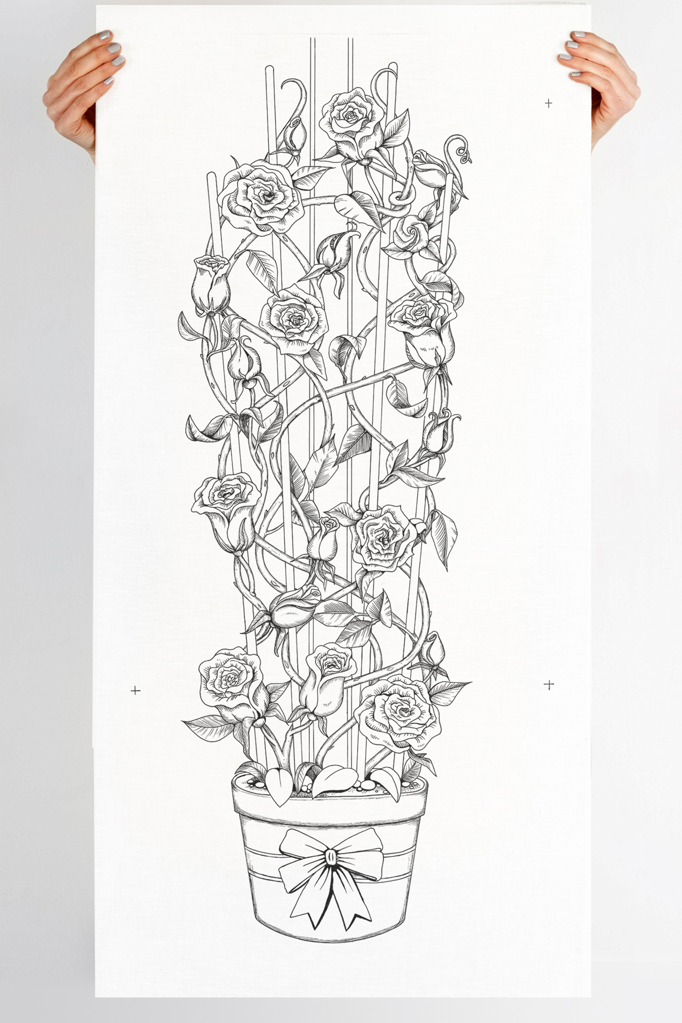
This illustration project was subcontracted to me via another one of my creative colleagues at Looksee Design. Their client, Knights Roses, is one of the leading distributors of roses around the country and were looking to update their packaging to give a celebratory feel to their existing cardboard box. This first box of the series is approx 820mm high x 270mm wide and contains their signature potted roses that are dispatched nationally.

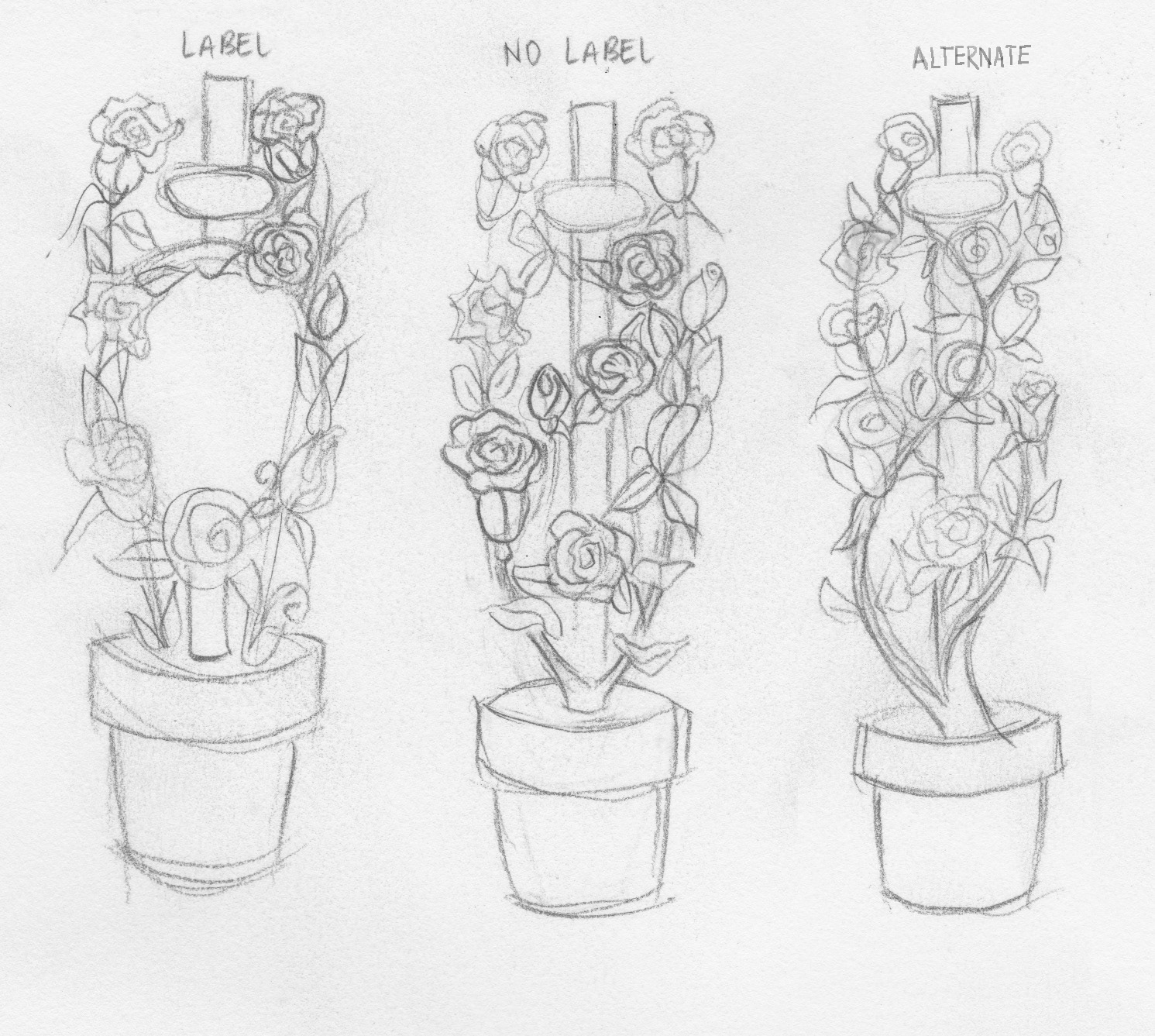
It's amazing that such a large scale illustration can start with as little as a thumbnail rough, but this is a fundamental part in the process to explore balance and composition. This small rough is sketched and resketched building more detail into the illustration as it grows.
Then began the intensive illustrative study of roses, petals and leaves, exploring every dimension to create jigsaw pieces to fit back into my intricate layout.
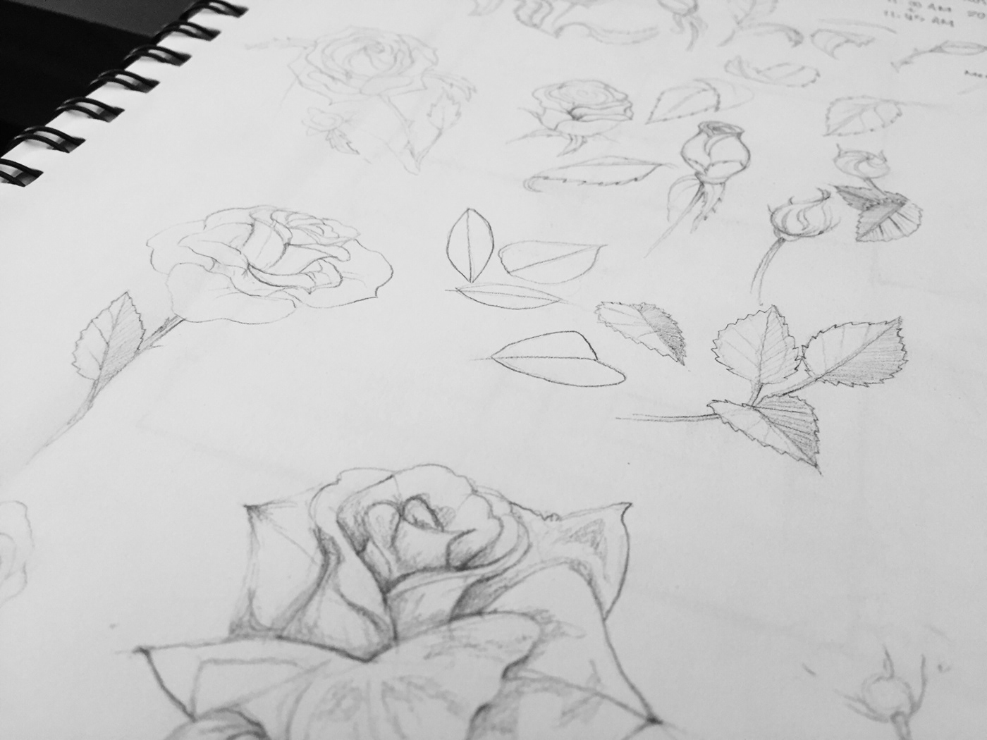
...lots and lots and lots of roses.
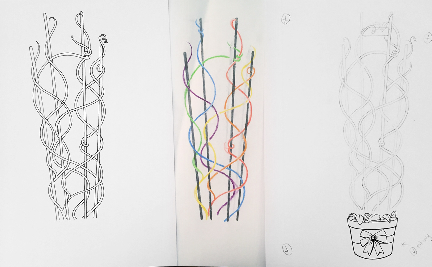
Each individual rose feature and fill in leaf were added onto a vine structure that followed the thumbnail line sketches, to keep the original flow of the first comps.

They were all fitted so closely together it was like a jigsaw puzzle, so we had to pull back the flowers to reveal more of the original structure in the first sketches. To do this I had to also prioritise each vine as they overlapped and wrapped their way around the trellis structure.
After a laborious 5 day inking in over three A2 sheets of 210gsm fine tooth dry media and tiling together to create one large banner, to provide enough detail and resolution for a large format box.