Hyper-realism.
This piece was commissioned to match an existing illustration style, of which no one knew the history of; original artist, or construction medium; traditional or digital. It was requested by a large advertising agency to feature on a packaging label, fitting into a series of existing products. As the previous history of the project was unclear, we set about finding the best match for the series, and began sketch phase.


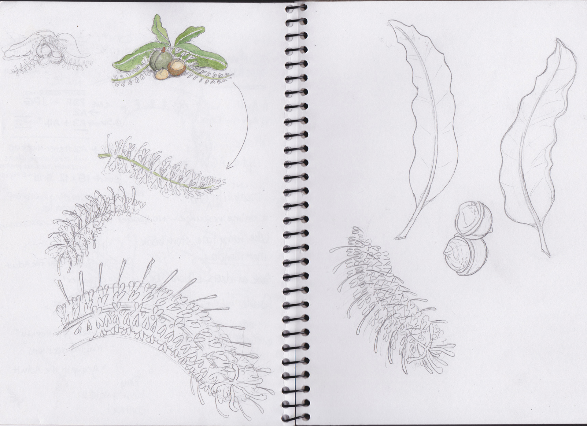
I researched Macadamias in detail and studied all visual resource intensely before starting on some sketches, adding colour indicators for reference for client feedback; concentrating on shapes, colours and composition. We were initially working to a rather tight deadline of one week so much of the foundation process was accelerated.


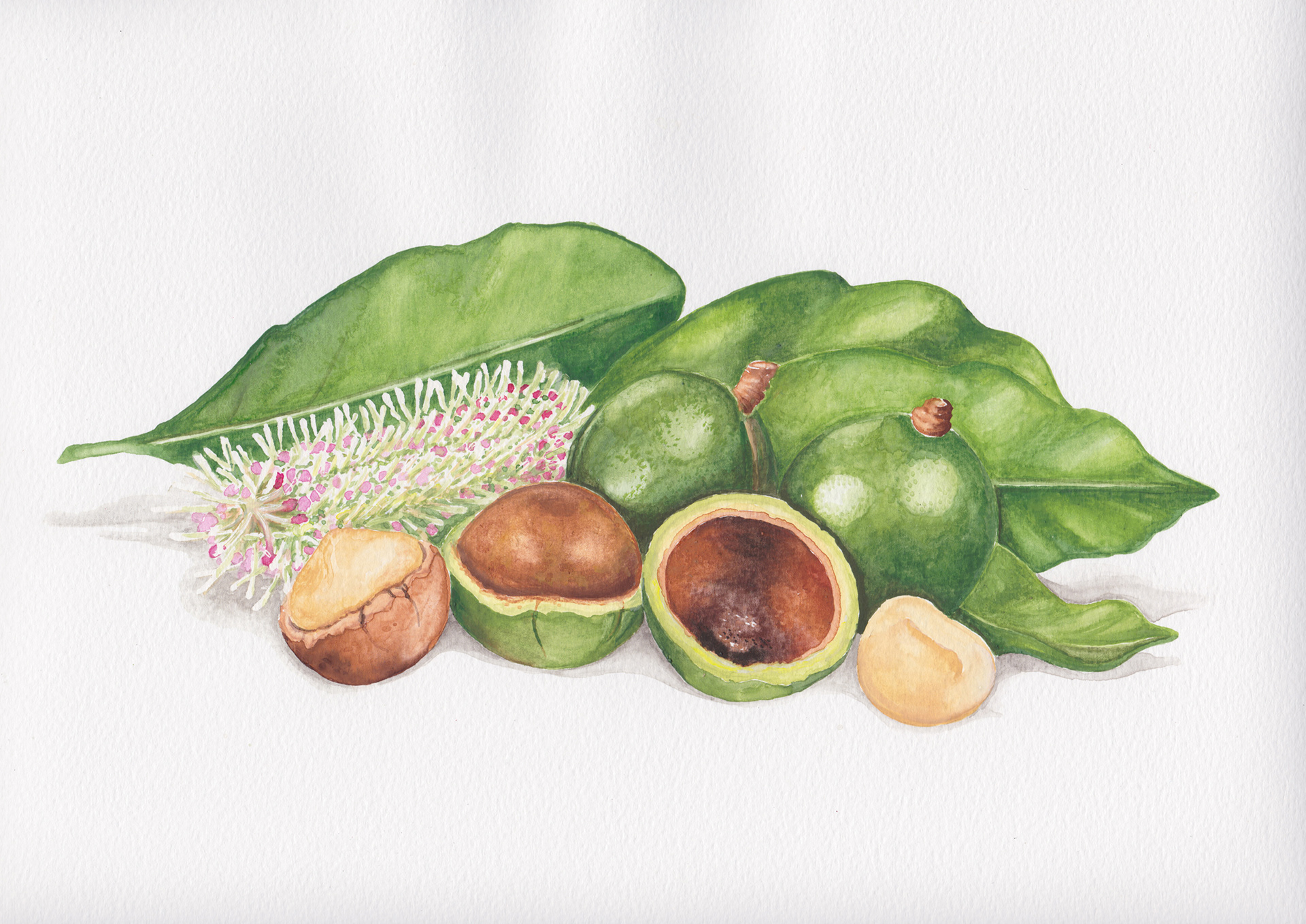
With tight deadlines looming, I advanced into a full render in watercolour, as had been discussed with the agency. This exploration gave me some super realistic textures to work with but the addition of a flower, had also created some new challenges.
Referencing back to the previous label images, we could see finer details were achieved by using vector shapes, but these lacked detail in the smooth blends around the rest of the illustration, so we started working towards blending the two. This eventually to vectorising everything and utilising the existing watercolour illustration for textural layering.
The final illustration was carefully constructed in PSD which allowed for the agency to make a few minor adjustments before placing into the artwork. Looking forward to seeing it on the shelves.
Overall this was a hugely rewarding project for me, in achieving an unlikely marriage of traditional and digital illustration.
Thanks to the agency team for your patience and perseverance.